Eco-friendly shopping
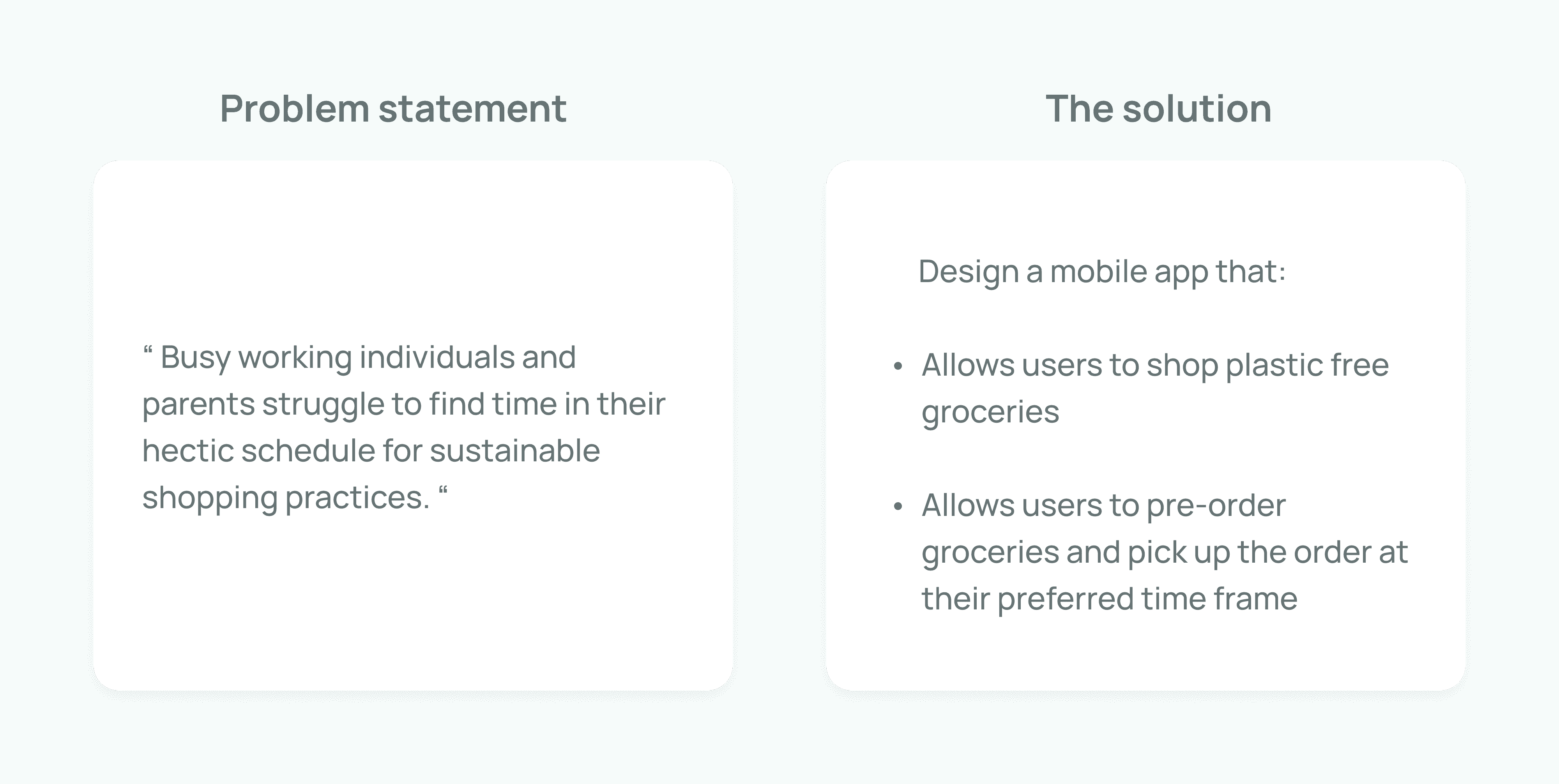
Zero-waste mobile app offers a convenient way for users to shop package-free groceries, meeting the demand for sustainable living in urban areas.
Role
UX/UI Designer
at Google UX Design
Duration
3 months
The problem
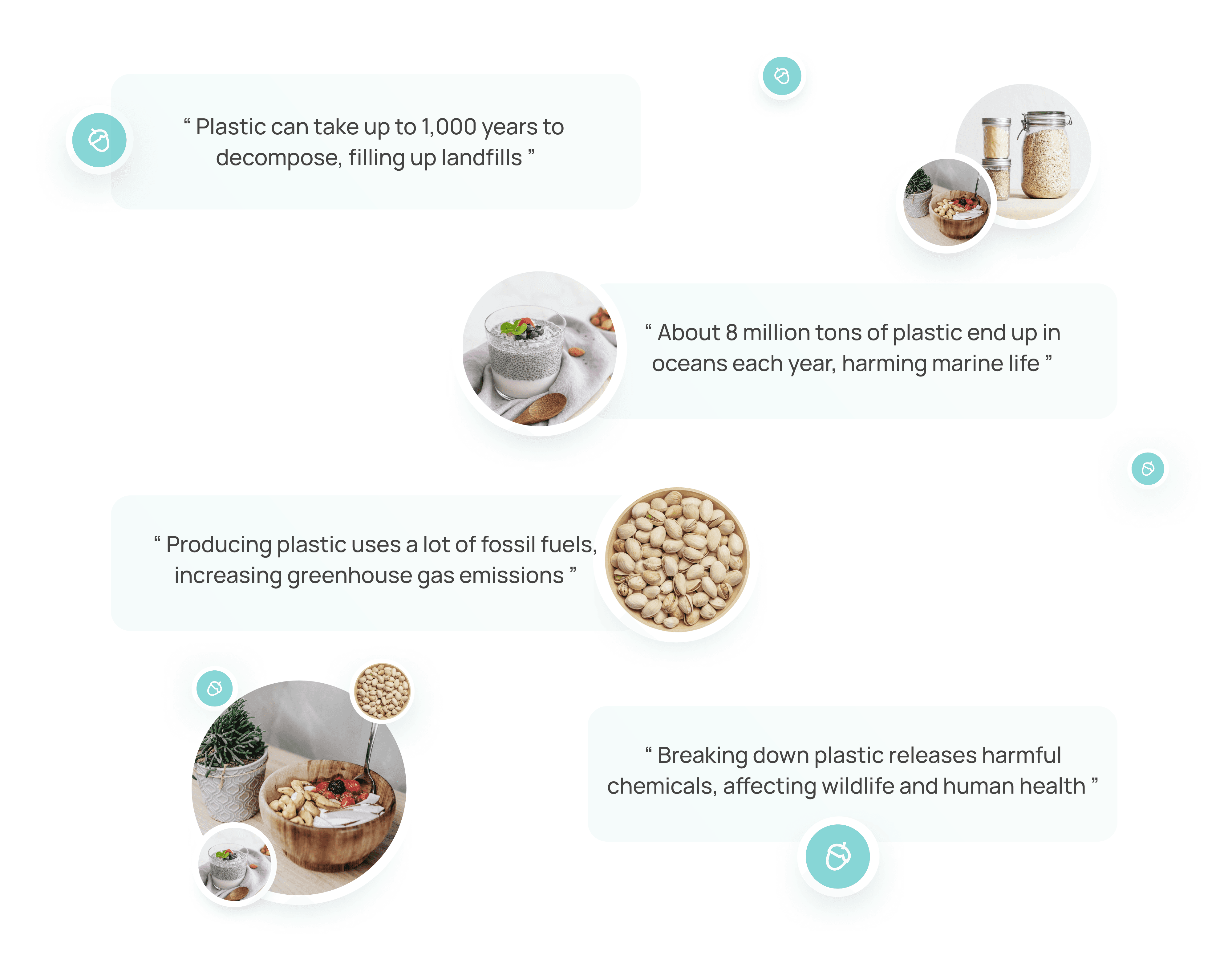
Plastic is heavily used in grocery shopping, from packaging to bags. Over 1 trillion plastic bags are used worldwide each year. This creates significant environmental damage:
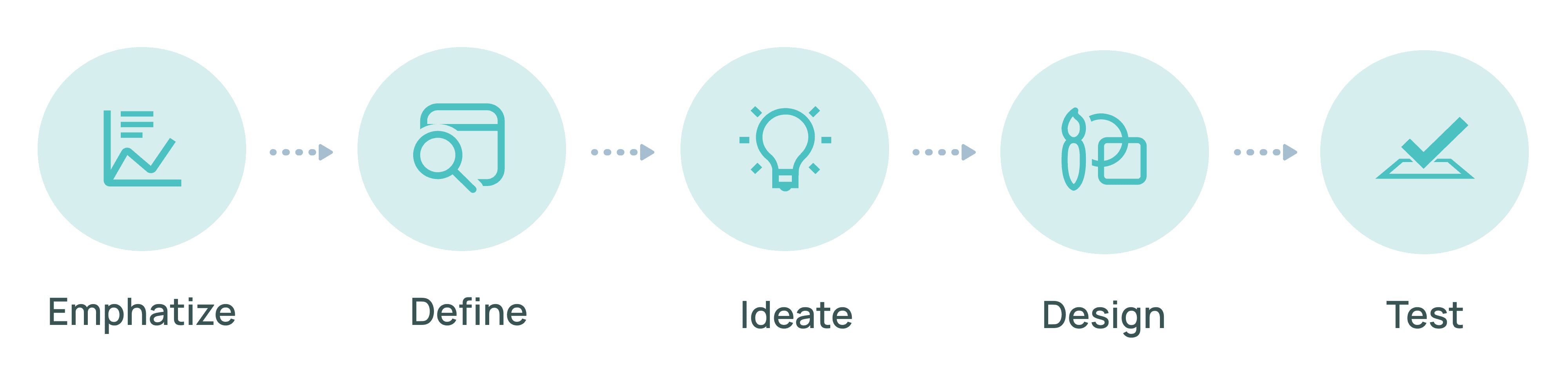
Design Thinking Framework
Using the Design Thinking framework helped me to keep the focus on user needs. It also allowed me to implement changes and adaptations based on user feedback, ensuring the designs are effective.
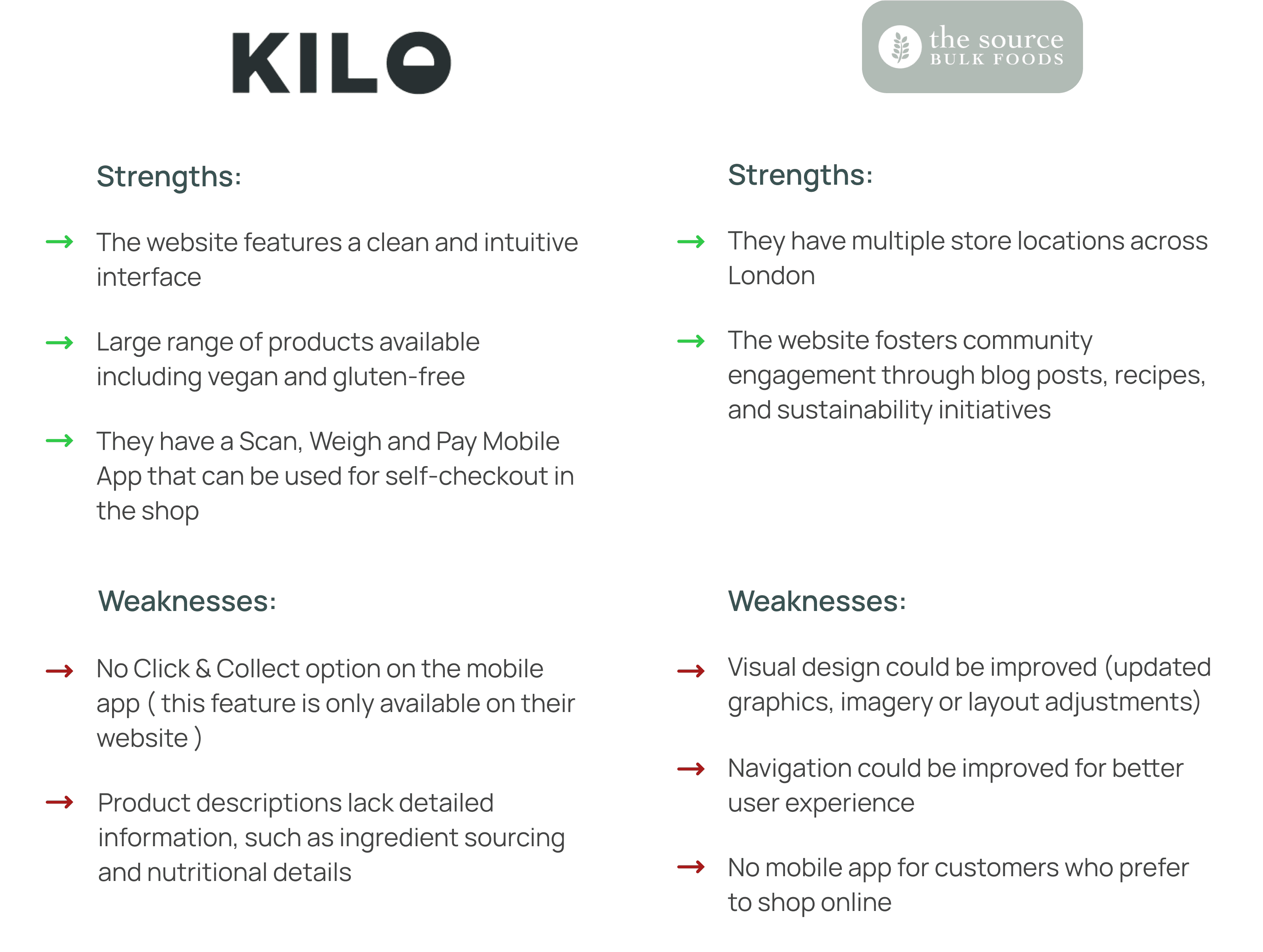
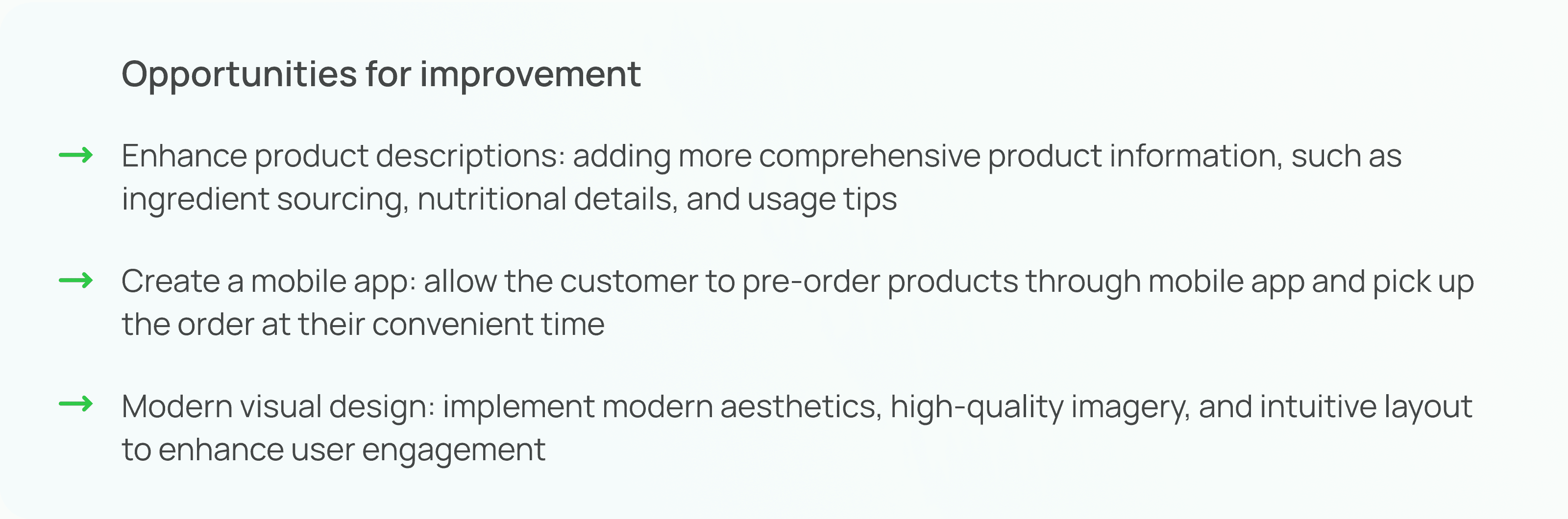
Competitive Analysis
Conducting competitive analysis helped me understand what users expect, to spot industry trends as well as to reveal opportunities for differentiation and improvement. Through market research, I identified two main competitors ( Kilo and The Source Bulk Food ) and evaluated their strengths and weaknesses in order to see how The Zero-waste Shop can fill any gaps.
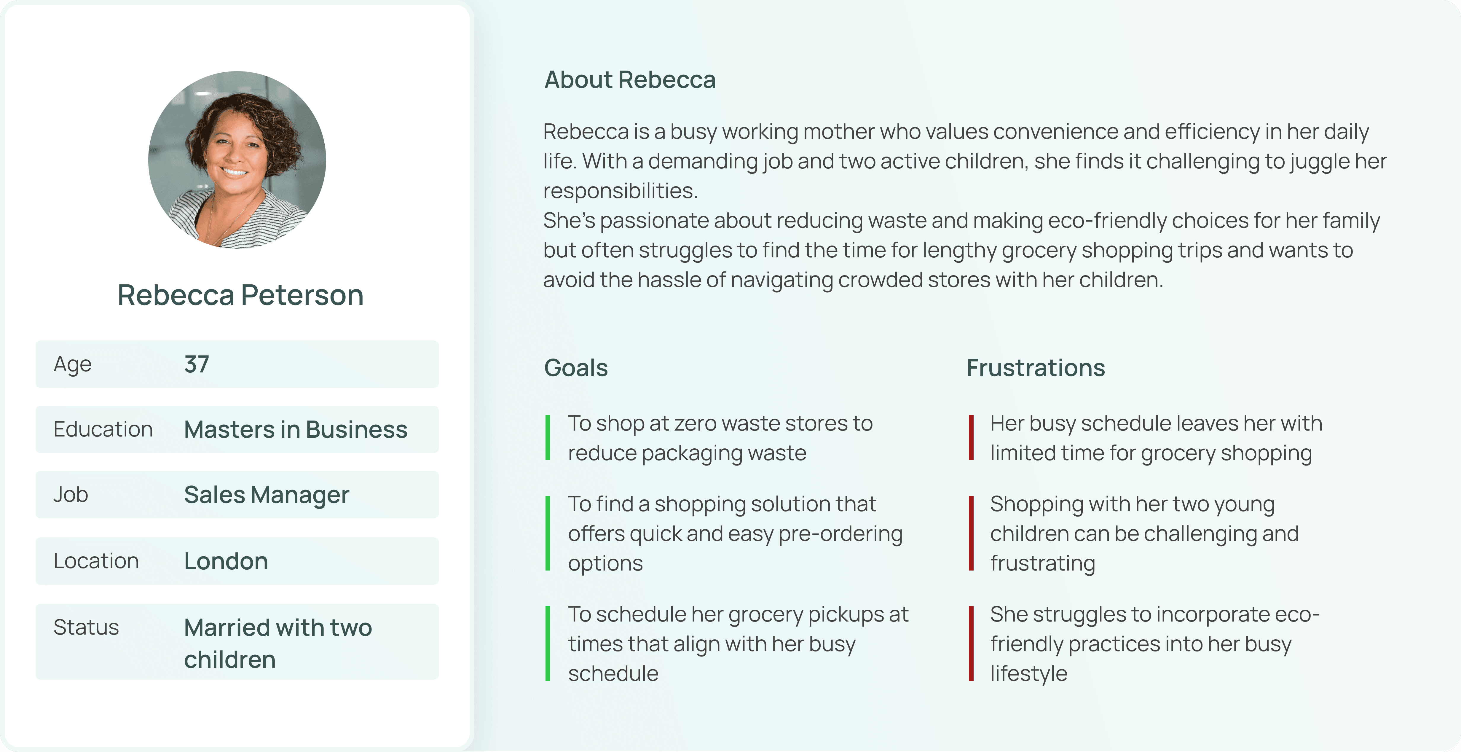
User Persona
I used everything that I learned from my secondary research to create a user persona. This helped me understand the users' goals, needs, and frustrations, so I could design solutions that truly fit their needs and improve their experience.
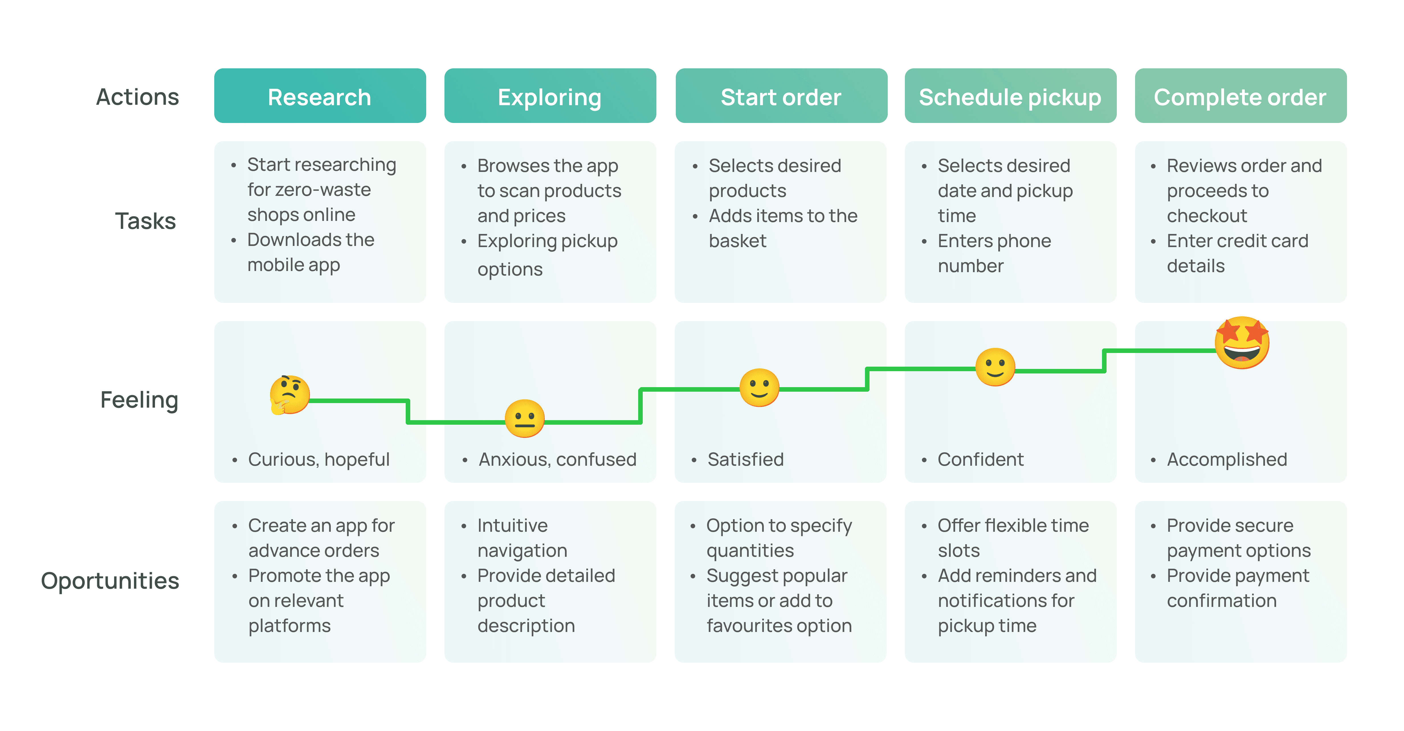
User Journey
The user journey helped me to map out the steps users take when interacting with a product, highlighting their experiences, emotions and potential pain points. This was a key step in the design process that helped me spot areas for improvement and make sure the experience is smooth and user-friendly.
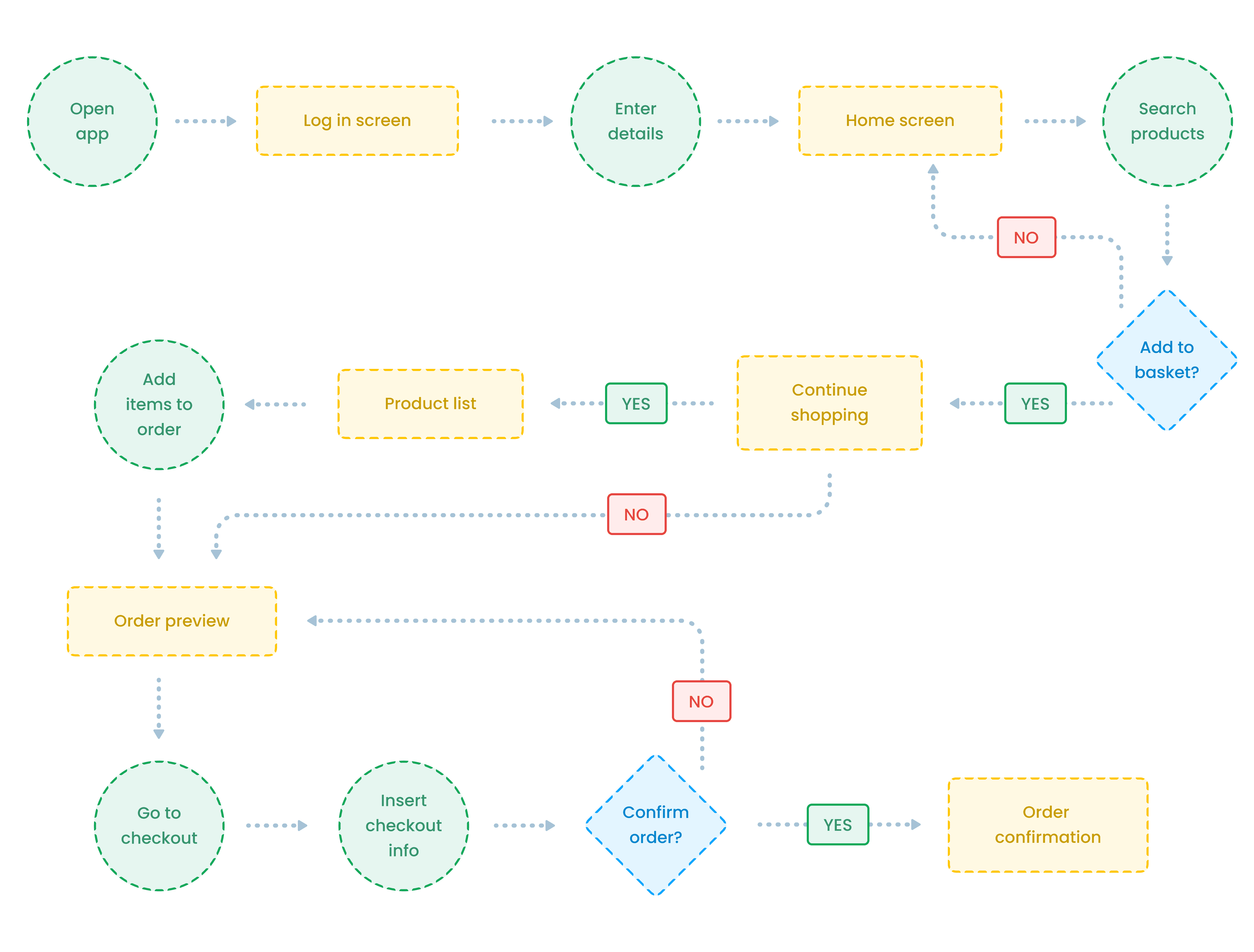
User Flow
Creating a user flow helped me to visualize the path users take to complete tasks within the mobile app. This clarity reduces user frustration and allowed me to ensure that the navigation is intuitive and efficient.
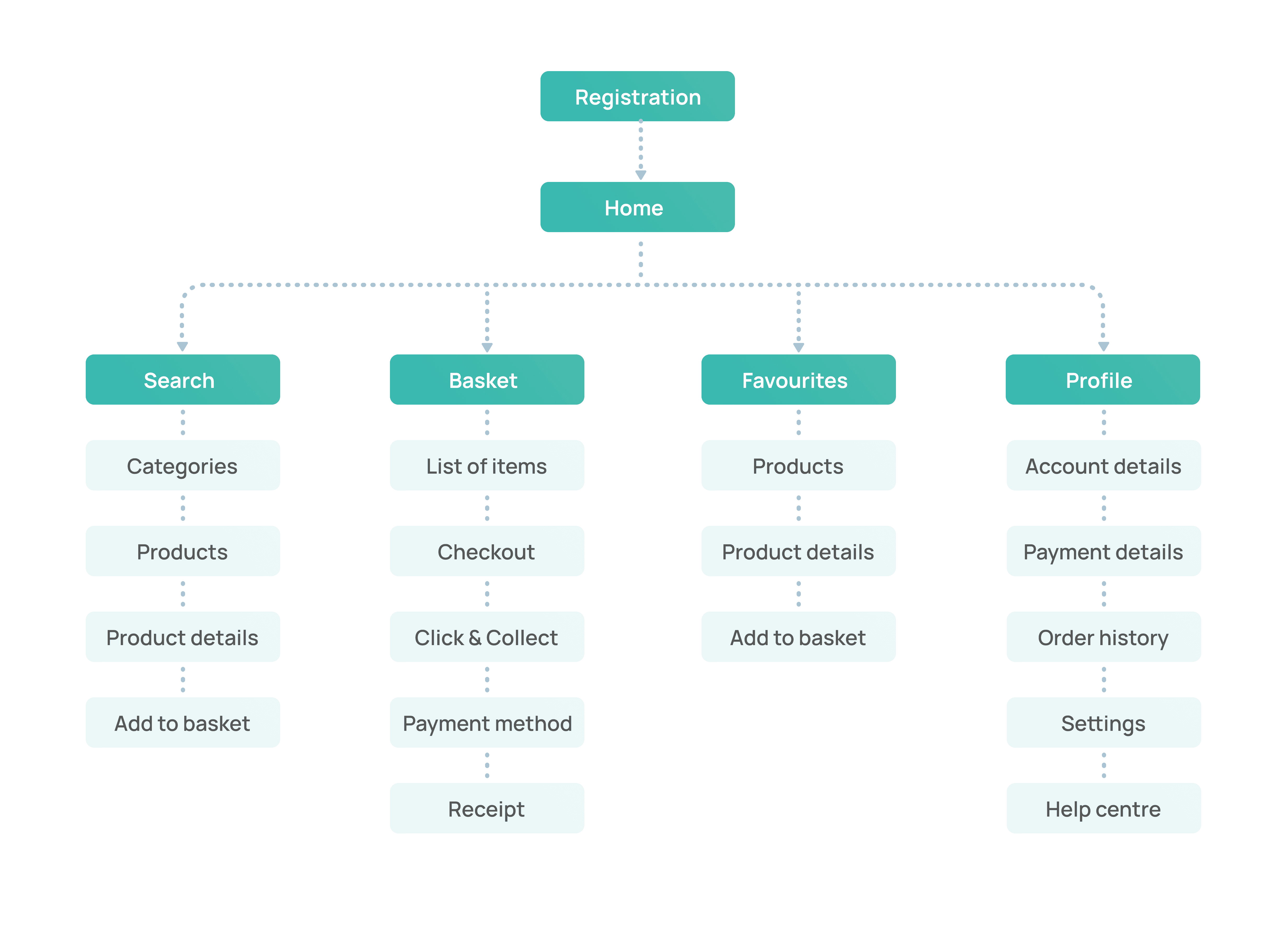
Information Architecture
This is the crucial part where the mobile app started to come together. It helped me to organize and structure content in a way that makes it easy for users to find what they need.
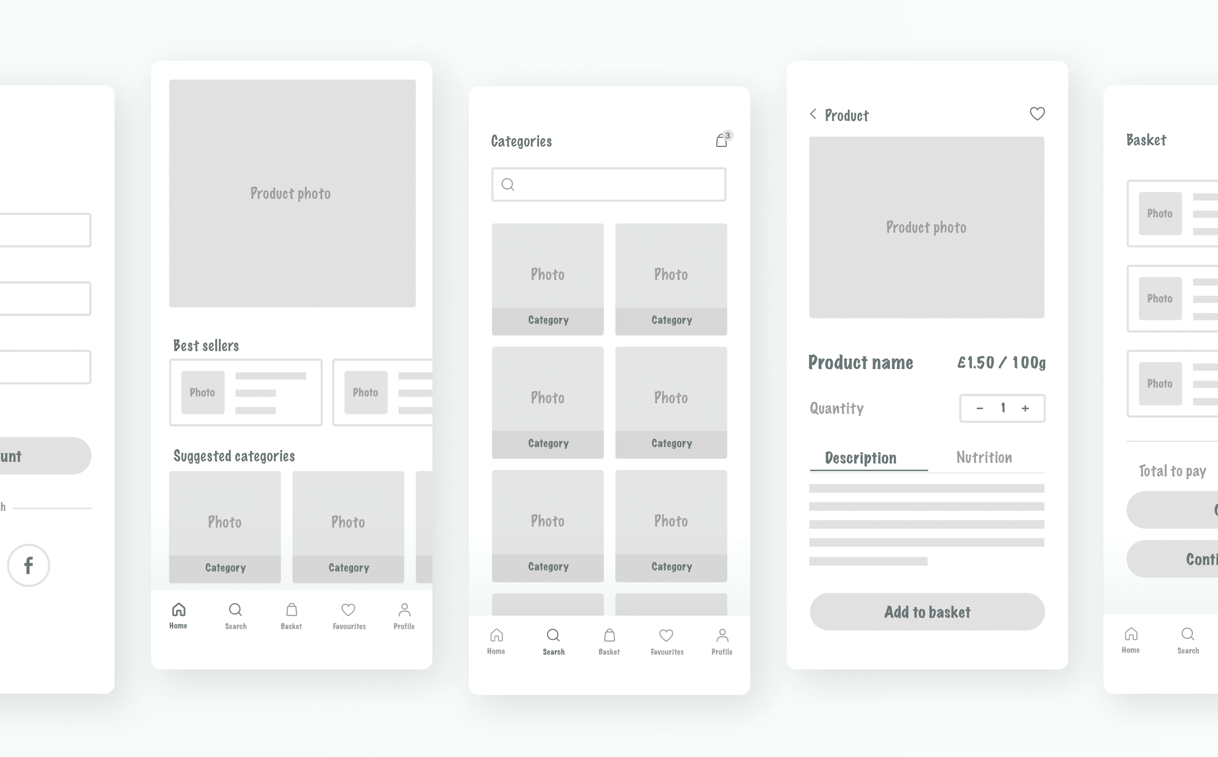
Low Fidelity Wireframes
Next, I created low-fidelity wireframes and a prototype to focus on the basic layout and structure, helping me understand the user flow and functionality before diving into detailed designs. This step-by-step approach made it easier to spot issues early, save time and gather feedback on concepts.
Usability Study
In this study, 5 participants complete the task of browsing, adding items into basket, multiplying the product's quantity and completing the order. Each participant completed a questionnaire about their experience. Here are the main conclusions:
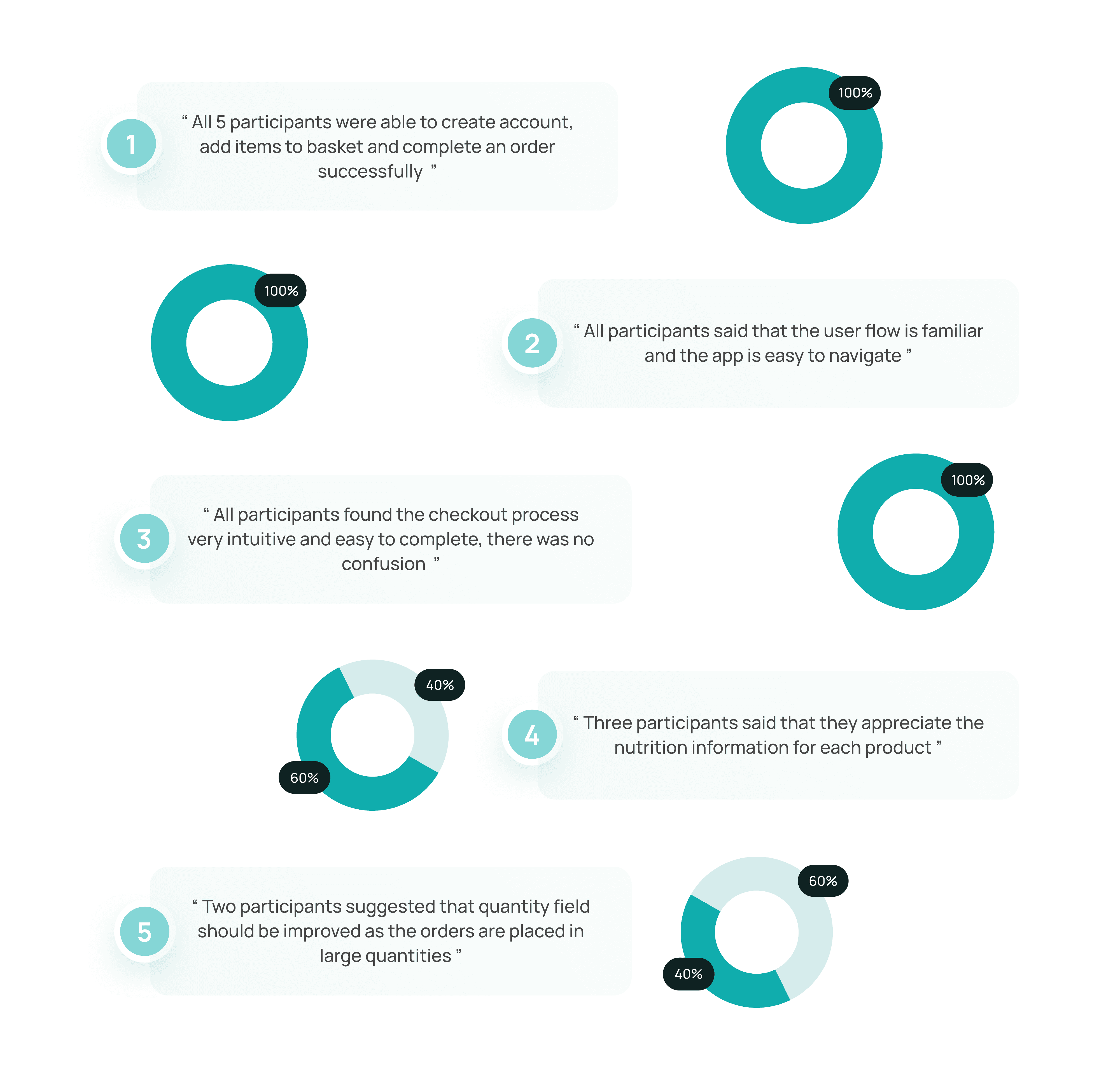
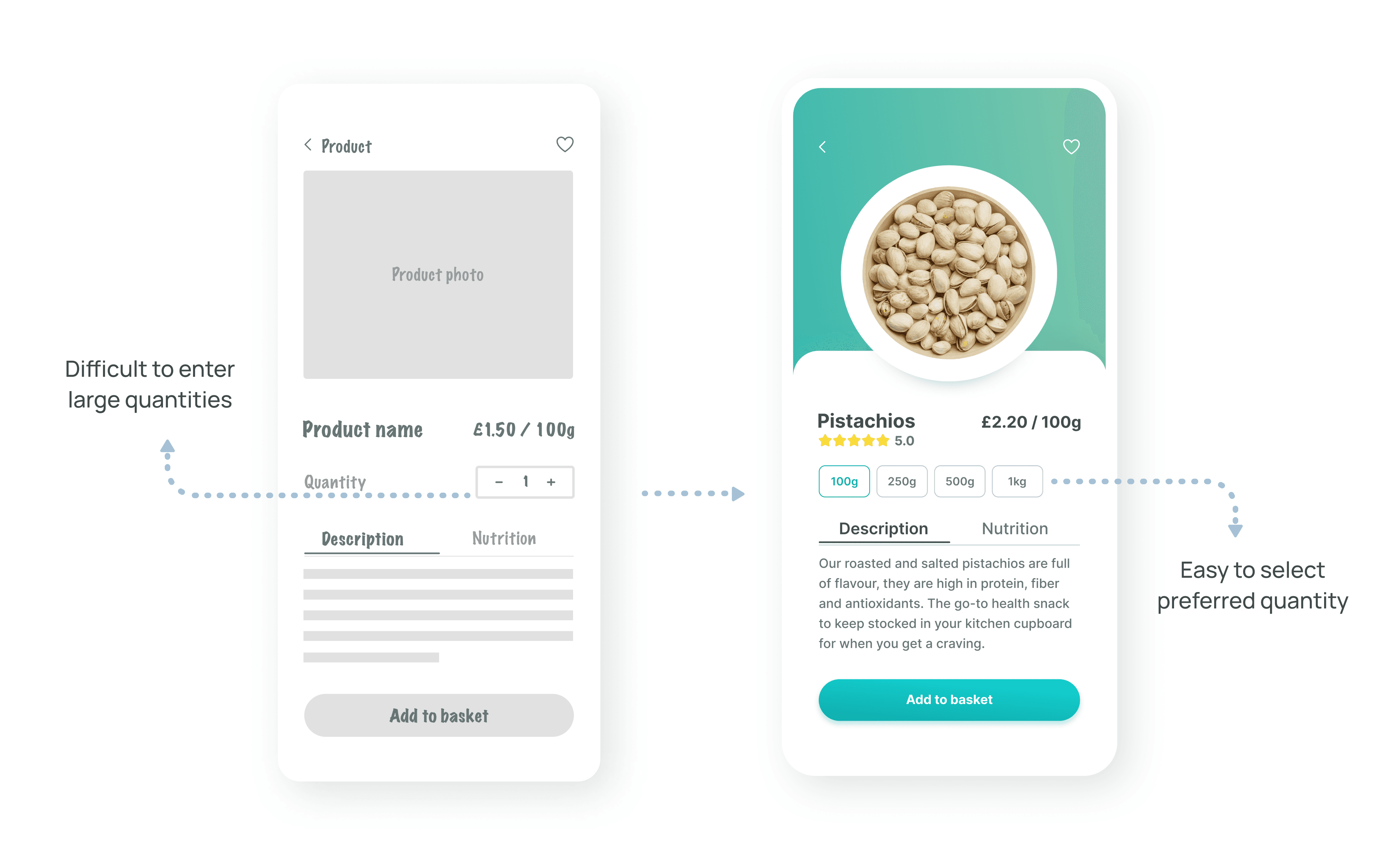
User Feedback & Refinement
During testing, some of the users found that entering the quantity of each product can be difficult and time consuming as it needs to be in larger quantities. To make it easier, I changed the quantity field and standardized the quantites to be easier for selection.
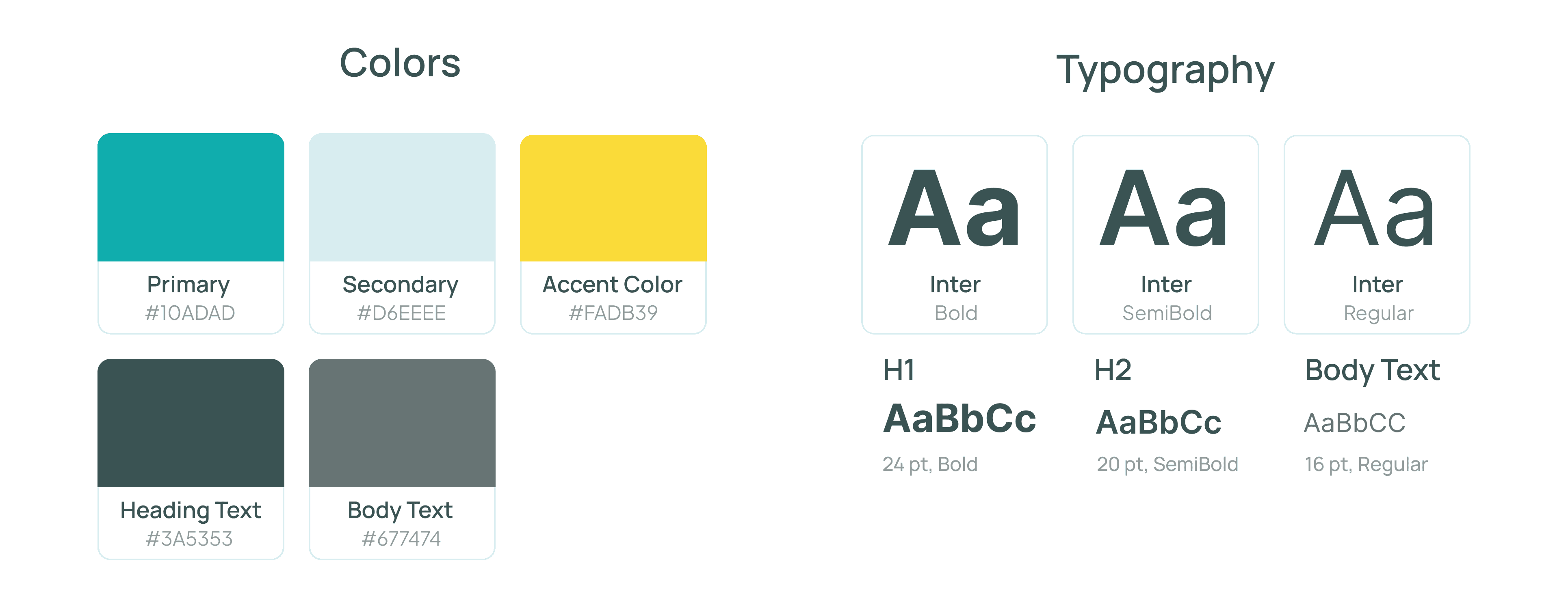
High Fidelity Prototype
Taking my revised wireframes, I now worked on creating final, high fidelity wireframes and created a final prototype. Started by defining the main elements of visual design such as colors and typography.
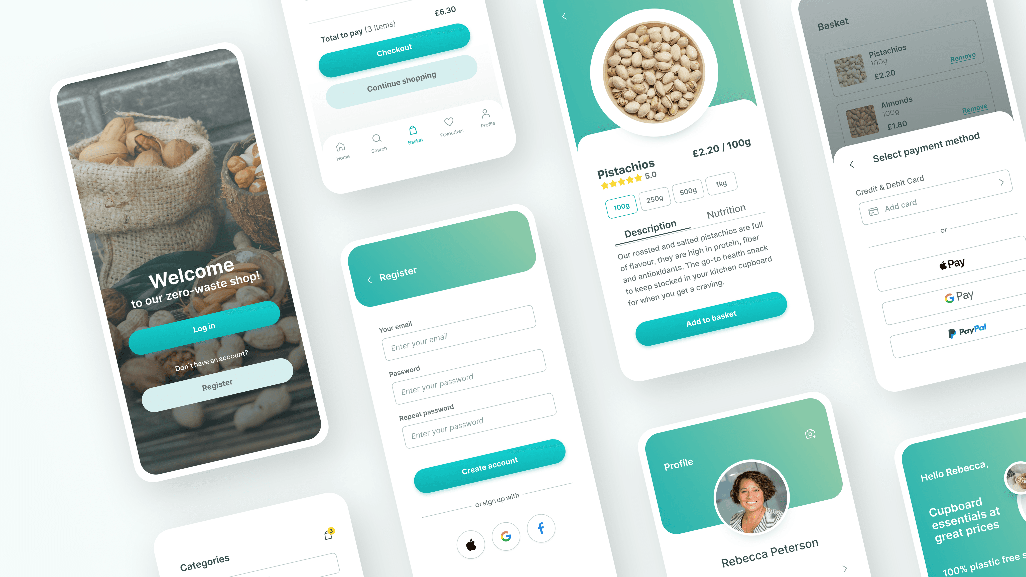
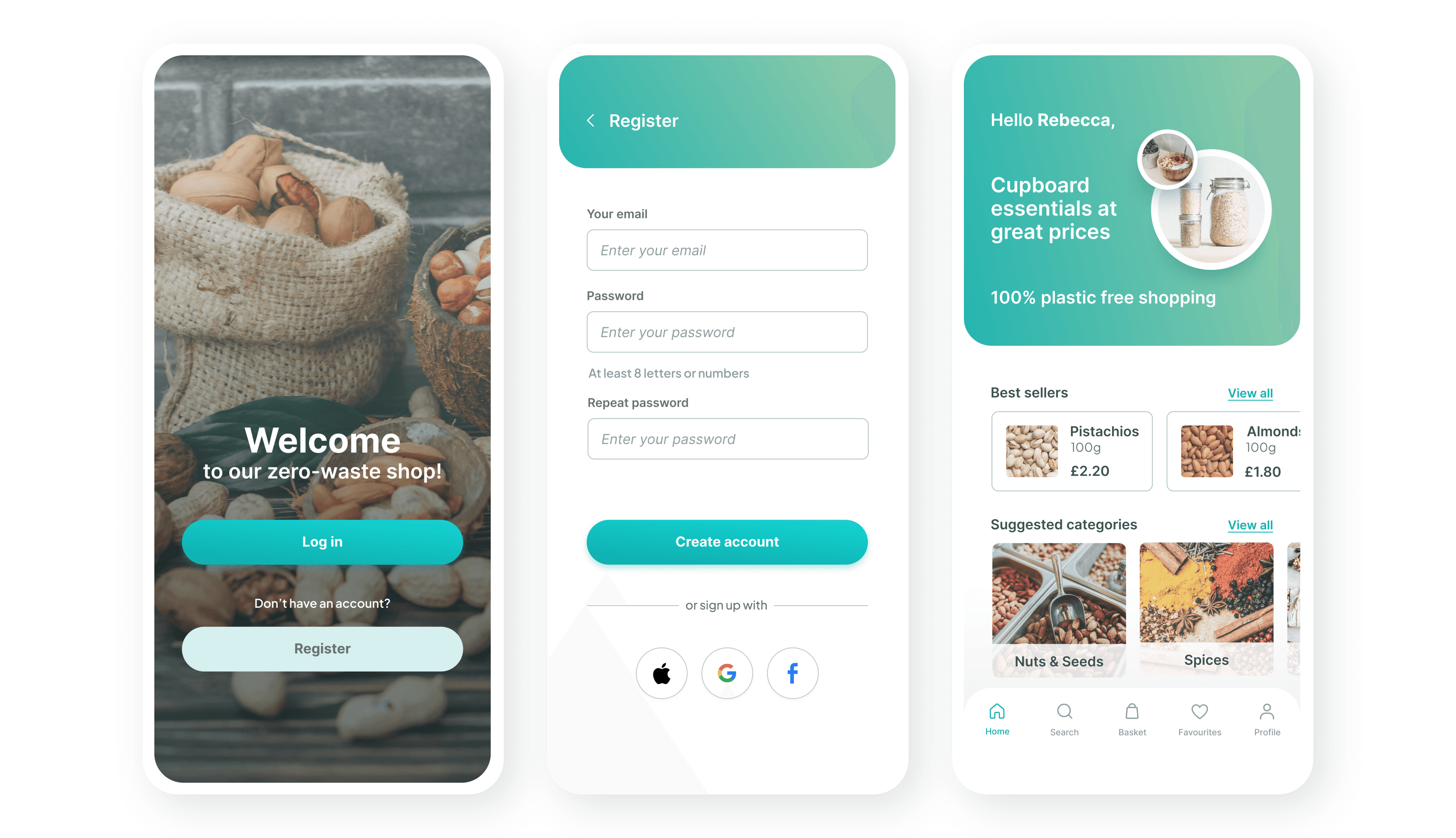
Wellcome , Login and Home Screens
The registration process has been greatly simplified
Users can register using Apple, Google or Facebook account
Users can find best sellers and main categories on the home screen to start their shopping
Product Screens
Option to select pre-defined quantity in order to simplify the ordering process
Nutritional information available for the users
A confirmation message that the item has been added to basket
Checkout Screens
Option to choose from a few different payment methods
Let users pick a date and time that works best for them
A confirmation message to let users know their payment went through successfully
All Screens
Next Steps
Next, I'll hand off the design to developers, providing all the necessary assets and details for building the app. Once the app is built, I'll conduct beta testing to gather feedback on its functionality and usability. This testing will help to make sure the app is stable and user-friendly before it's released to everyone. After launch, I'll keep an eye on how users interact with the app, gather feedback and make improvements as needed. Observing how people use the app will guide future updates and new features.